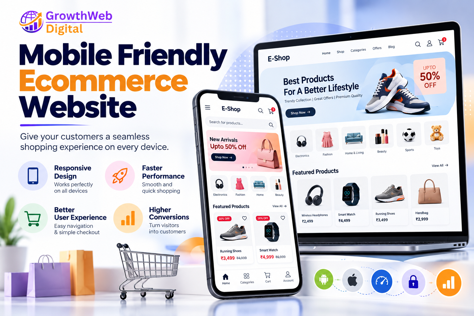
Mobile Friendly Ecommerce Website | Why It Matters For Online Business Growth
Therefore, your ecommerce website needs to be Mobile Friendly Ecommerce Website.
An ecommerce website which looks stunning on a desktop but is hard to use on a mobile phone can lose customers. Poor text size and page speed, difficult navigation, checkout process, buttons, and unreadable text can turn customers away from your ecommerce website.
A mobile-friendly ecommerce website creates value, increases engagement, conversions, and brand image.
In this blog, we will be discussing what is a mobile-friendly ecommerce website, why it is important, what are the most important features of a mobile-friendly ecommerce website, and how businesses can build an ecommerce website with mobile users in mind.
What Is A Mobile Friendly Ecommerce Website?
A Mobile Friendly Ecommerce Website is a mobile-friendly online shopping website that looks stunning and can be used on mobile phones and other handheld devices. The text size, images, and overall layout of the website change depending on the screen resolution of the device being used to view the website.
Customers can comfortably perform the following tasks on a mobile-friendly ecommerce website:
• Easily navigate around the website
• Shop the website catalog
• Add products to their wish list or cart
• Checkout and make a payment
• View website content
The overall layout should not require the users to zoom in or out or scroll horizontally to view images or website content.
A mobile-friendly ecommerce website focuses on being intuitive, fast, accessible, and provides a better customer experience for mobile users.
Why Mobile Friendly Ecommerce Design Is Important
Customers demand a seamless mobile shopping experience.
As soon as a customer lands on your website on their mobile phone, they expect to be able to find the following on your website:
• Prices
• Images
• Sizes
• Colors
• Availability
• Reviews
• Offers and discounts
• Delivery information
If they cannot find this information on your mobile website, they will leave and go to your competitor’s website.
A mobile-friendly ecommerce design ensures that you are able to:
• Deliver an improved customer experience
• Increase engagement
• Boost product views
• Increase enquiries
• Improve checkout experience
• Improve ecommerce SEO
• Create more sales opportunities online
1. Use Responsive Ecommerce Website Design
Responsive design makes your website mobile-friendly. With a responsive ecommerce website, you can display your website on different devices including desktop computers, laptops, tablets, and smartphones. The responsive design fluidly moves and changes the website’s layout depending on the screen resolution of the device being used.
Responsive design changes the website’s layout, fonts, spacing, images, and product catalog to suit the device on which it is being viewed. For example, 4 products displayed in a row on a desktop computer will automatically stack vertically on a mobile phone.
2. Keep Mobile Navigation Simple
Ecommerce websites have multiple categories and products. Websites often use mega menus on their desktop versions to display their products and services. But mega menus are not always easy to use on mobile phones. Mobile navigation menus should be simple and the most important categories should be highlighted.
Use the following mobile navigation menu best practices:
• Avoid using long dropdowns or nested navigation
• Keep buttons and links easy to click
• Do not place too many links in a small space
Use a hamburger menu, search bar, category menu, shopping cart, account icon, and other relevant icons to create a simple but powerful mobile navigation menu.
3. Improve Mobile Website Speed
Website speed plays a critical role in the overall performance of your ecommerce website. Large images, animations, videos, and scripts can make your website load slower on mobile devices. It is recommended to keep your mobile website as light and fast as possible. Here are some simple ways to improve your website’s speed:
• Compress website images
• Use image compression tools
• Optimize videos
• Avoid using unnecessary scripts
• Use website caching
• Optimize your code
• Improve server response time
• Lazy load your images
Improving your mobile website speed leads to a better user experience.
4. Use Clear Product Images
Customers cannot touch or feel your product while shopping on your website. Therefore, images play an important role in influencing a customer’s buying decision. A mobile-friendly ecommerce website should use high-quality product images that are easy to see on a mobile screen. Customers should be able to see the front, back, sides, and other important visuals of the product image.
Product images should be large enough and optimized to avoid slowing down your website.
5. Write Easy-To-Read Product Information
Mobile-friendly ecommerce websites should avoid using too much text or using small text sizes. Product descriptions should be easy to read using short paragraphs. Information should be presented in a structured manner using specification tables, bullet points, and other relevant formatting.
The following information should be easy to read and understand on a mobile-friendly ecommerce website:
• Price
• Availability
• Description
• Size
• Delivery
Avoid putting too much text in one space and make sure the information is not difficult to read.
6. Make Buttons Easy To Tap
Make sure your buttons are big enough to be tapped with a finger. Buttons should also be spaced well so that users do not accidentally tap the wrong button. The following buttons should be made larger and easier to tap:
• Add to Cart
• Buy Now
• Check Out
• Apply Coupon
• View Product
• Contact Us
Make sure your buttons have a clear call-to-action to help users know what will happen when they tap the button.
7. Simplify The Mobile Checkout Process
Checkout is an important step in the ecommerce buying process. But a complicated checkout process can turn customers away from completing their purchase. Simplify the mobile checkout process by only asking for relevant customer information. The checkout information requested may include:
• Full name
• Phone number
• Email address
• Delivery address
• Payment method
Make sure your checkout fields are big enough to type the information. Avoid putting extra steps between the cart and the payment page.
8. Offer Multiple Payment Options
Customers use different payment methods to make payments on ecommerce websites. Based on your target market and payment integration options, you can choose from the following popular payment options:
• UPI
• Credit Card
• Debit Card
• Net Banking
• Wallet
• Cash on Delivery
Payment gateways should also be mobile-friendly and the payment process should be simple and secure.
9. Optimize Your Product Search
Customers search for products on your ecommerce website. Make sure the search bar is easy to locate and use on a mobile-friendly ecommerce website. You can also optimize your product search by including the following features:
• Search suggestions
• Search by product name
• Search by category
• Filters
A well-optimized search feature helps your customers find products faster.
10. Add Product Filters
Product filters are important for an ecommerce website with a large product catalog. Customers use product filters to narrow down their product search based on the following criteria:
• Price
• Brand
• Size
• Color
• Category
• Rating
• Availability
Product filters make it easier for customers to find the products they are looking for. Product catalog filters are best displayed as a drawer on a mobile-friendly ecommerce website.
Avoid putting product filters below a long list of products.
11. Use Mobile-Friendly Product Cards
Product listing pages should be simple and should not have too much text. Product cards should include the following details:
• Product image
• Product name
• Price
• Discount
• Rating
• View product or add to cart
Only include important product details in your product cards.
12. Make The Shopping Cart Easy To Use
Shoppers always want a simple and intuitive shopping cart. Your cart should be easy to locate and should not require too many steps to make a purchase. Customers should be able to change the quantity of the items in their cart, remove products, view the checkout page, and apply coupons with ease.
Your cart should update automatically as customers make changes to their order.
13. Focus On Building Trust On Mobile
Customers are always skeptical about making a purchase on a new ecommerce website. Focus on building your customers’ trust by making sure that all the necessary trust signals are included in your mobile-friendly ecommerce website. Some essential trust signals include:
• Secure payment options
• Refund and return policies
• Shipping policies
• Customer reviews
• Contact information
• Company information
• Privacy Policy
• Terms and Conditions
Make sure all the trust signals are mobile-friendly.
14. Use Customer Reviews
Customer reviews are a powerful tool that can influence a customer’s buying decision. Include customer reviews on your product pages to help your customers learn more about the products they are interested in. Include the following customer review highlights:
• Ratings
• Written reviews
• Reviews about the product experience
• Verified purchase
Avoid overcrowding your product page with customer reviews.
15. Improve Your Mobile Ecommerce SEO
A mobile-friendly ecommerce website is important for improving your ecommerce SEO. You should optimize your website with the following SEO strategies:
• Optimized product titles
• Unique URLs
• Meta tags
• Headings
• Images
• Internal linking
• Structured content
• Clean code
• Accelerated Mobile Pages
Your product catalog and category pages should not have too much text. Avoid duplicate content across your website and make sure you optimize your product descriptions for SEO.
16. Optimize Your Category Pages
Category pages are important for both end-users and search engines. A well-optimized category page should include:
• Category title
• Category filters
• Product catalog
• Sorting options
• Useful category description
Avoid including too much text on your category page. Use simple sorting and filtering options that are easy to access on a mobile-friendly ecommerce website
17. Use The Mobile-First Approach
A mobile-first approach means that you design and build your website for mobile users first and then scale it for desktop computers and other devices. It is a good practice to build your website with smaller screens in mind first. This approach helps you prioritize the most important features and elements that will enhance the overall mobile user experience.
Some mobile-first design best practices include:
• Prioritizing features
• Improving page speed
• Creating intuitive interfaces
• Building stronger calls-to-action
• Making information easy to read
Avoid including unimportant elements that can bloat your mobile website design.
18. Avoid Too Many Pop-Ups
Pop-up ads and banners are useful marketing tools but they should be used sparingly. A pop-up ad should also not take over the entire screen on a mobile device. Make sure your pop-up ads can be closed easily and avoid using multiple pop-up banners at the same time.
19. Add Easy Customer Support Options
Most customers have questions before they make a purchase on your ecommerce website. Make sure you include the following easy customer support options on your mobile-friendly ecommerce website:
• Phone
• Contact form
• Live chat
Avoid using pop-up windows for your contact form. Make sure your contact form is mobile-friendly.
20. Test Your Ecommerce Website On Different Devices
Do not rely only on your mobile device to view your ecommerce website. Make sure your website design and features work seamlessly across different devices and browsers. Avoid making incorrect assumptions about your target market and always test your website on the following devices:
• Different mobile screen sizes
• Android phones
• iPhones
• Tablets
• Different browsers
Make sure the following features and functionalities work properly across different devices:
• Easy menu navigation
• Search bar
• Product selection
• Add to Cart
• Checkout
• Payment
• Contact form
Conducting regular tests helps you discover errors and improve your website’s performance.
Benefits Of A Mobile Friendly Ecommerce Website
A mobile-friendly ecommerce website has many benefits for businesses including:
Better User Experience
Your mobile-friendly ecommerce website provides a seamless online shopping experience that delights your customers.
Higher Engagement
Mobile-friendly menus and intuitive navigation increase engagement and encourage users to explore more products.
Better Conversion Rate Opportunities
A mobile-friendly checkout process encourages users to complete their purchases.
Improved Brand Image
An easy-to-use mobile website creates a great impression and enhances your brand image.
Better Search Results
A mobile-friendly ecommerce website is a vital component of a successful technical and user-focused SEO strategy.
Greater Customer Reach
Your mobile-friendly ecommerce website makes it easy for your customers to find your business online.
Mobile Friendly Ecommerce Website For Small Businesses
Small businesses can benefit significantly from responsive ecommerce development. A mobile-friendly ecommerce website helps small businesses reach new customers and grow their sales. Small businesses should prioritize building an intuitive mobile ecommerce website with essential features like products, shopping cart, payments, contact information, and responsive design. As their business grows, they can invest in more advanced ecommerce features.
Mobile Friendly Ecommerce Website For B2B Businesses
B2B ecommerce websites often require more advanced features to run smoothly including bulk enquiry, product catalog, request for quotation, dealer portal, distributor portal, and custom pricing. These features also need to be mobile-friendly as business buyers often browse products and place orders on their mobile devices.
Mobile Friendly Ecommerce Website For Retail Busineses
Retail businesses can use ecommerce websites to sell their products online and complement their offline sales channels. A mobile-friendly ecommerce website can help your retail business sell products online with features like categories, offers, online payments, delivery information, and store information. The responsive design makes it easy for your customers to access your website on their mobile devices and shop your catalog of products.
Common Mobile Ecommerce Website Mistakes
Avoid the following common mobile ecommerce website mistakes:
• Too slow
• Too small text size
• Too small buttons
• Too much horizontal scrolling
• Difficult menu navigation
• Too many pop-up banners
• Too small product images
• Too long checkout form
• Difficult payment process
• No shipping information
Mobile Friendly Ecommerce Website Development By GrowthWeb Digital
At GrowthWeb Digital, we can design and develop ecommerce websites that fulfill the unique requirements of your business. A modern ecommerce development agency will ensure that your ecommerce website is developed using the following responsive design features:
Responsive Design + Product Catalog + Shopping Cart + Secure Checkout Payment Gateways + SEO-Friendly URLs + Admin Panel + Mobile Optimization
We will build an ecommerce website that is easy to use for your customers and easy to manage for your business.
Whether you are a new startup launching an ecommerce business or you want to enhance an existing online store, responsive design should be the foundation of your ecommerce development strategy.
Conclusion
A Mobile Friendly Ecommerce Website helps businesses build a better online shopping experience for your customers. A mobile-friendly ecommerce website focuses on responsive design, intuitive navigation, quick checkout process, mobile-friendly payment options, and customer support. The most successful ecommerce websites offer the following:
Fast Performance + Easy Navigation + Mobile-Friendly Design + Secure Shopping + Better User Experience
You should always test your ecommerce website and invest in improvements to eliminate poor mobile shopping experiences. If you are developing a new ecommerce website or enhancing an existing online store, GrowthWeb Digital offers responsive ecommerce website development, custom website development, ecommerce solutions, ui/ux design, and seo services. We offer complete digital marketing services to help you dominate your niche online.